
Results
- 3audiences in one brand: youth, elderly, donors
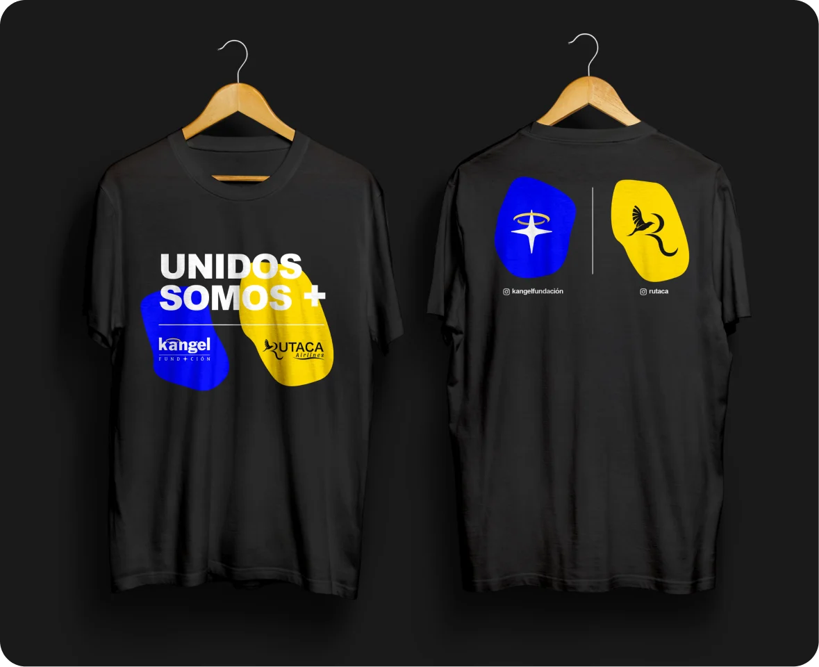
- Rutacaairline alliance with co-branded wear
- 1star that works with or without the name
The problem
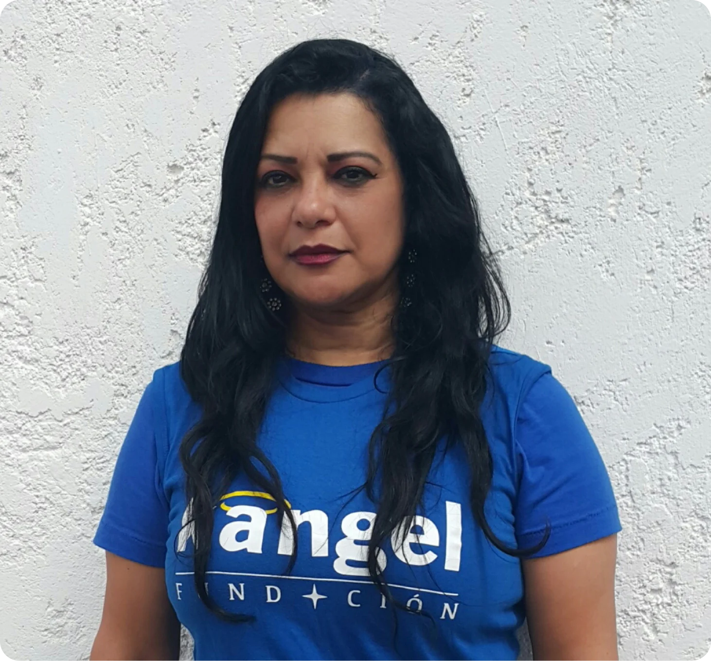
Karelis wanted to give back to people in need across Venezuela. The foundation needed one compassionate identity for youth, the elderly and donors alike.
The name joins the K of Karelis with angel, after people who said she was like the light of an angel.
Key decisions
- 01
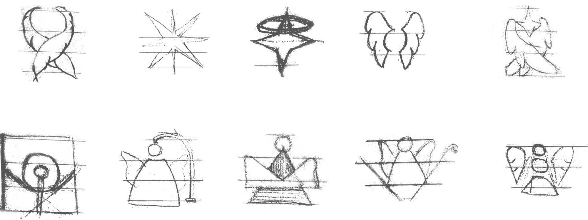
An icon of angelic light
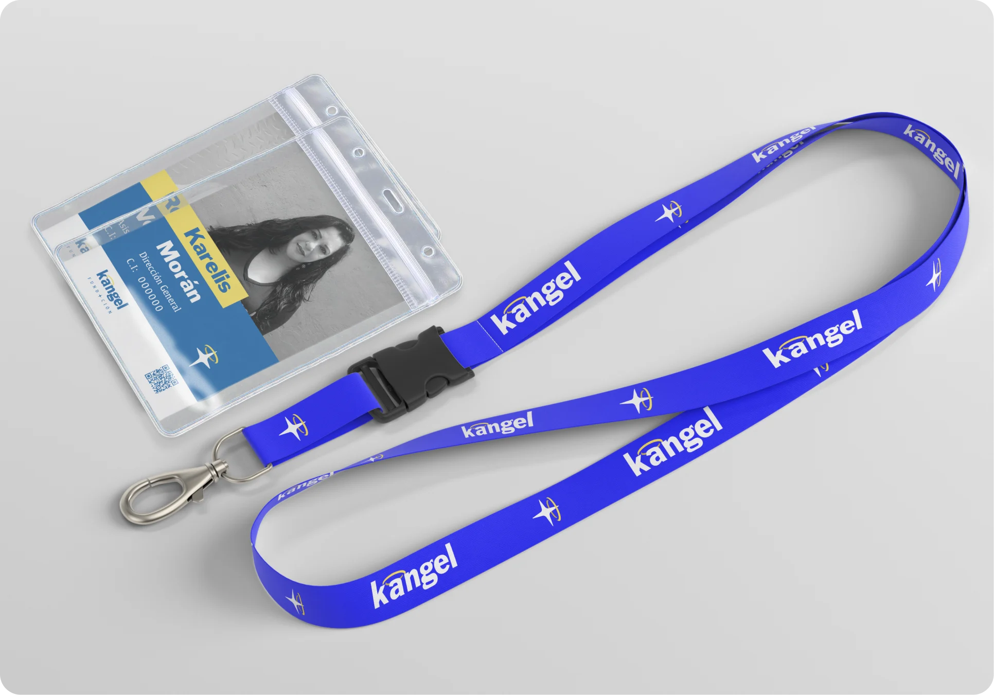
The star with its halo turns the story behind the name into one simple mark.
- 02
Read from afar
A heavy, legible typeface makes the foundation feel solid and grounded.
- 03
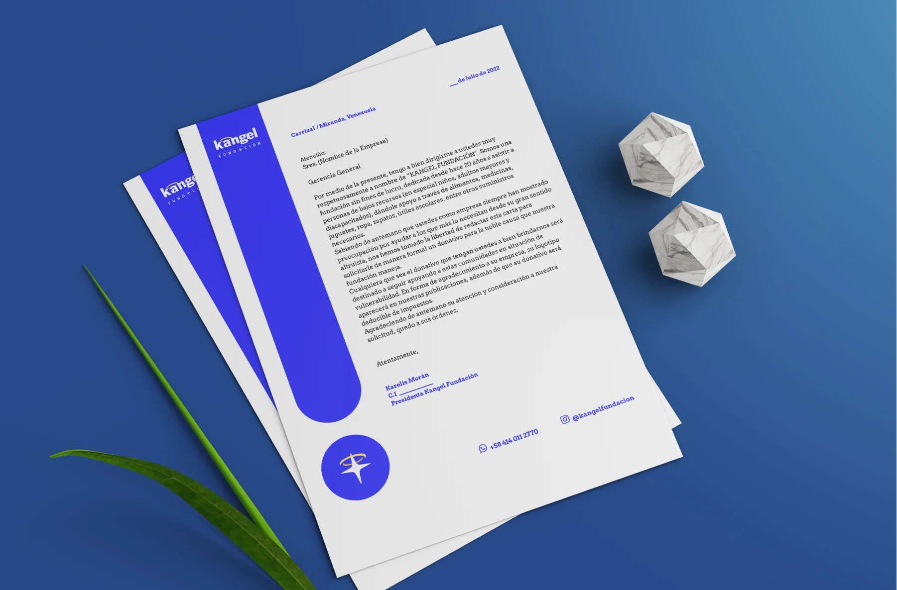
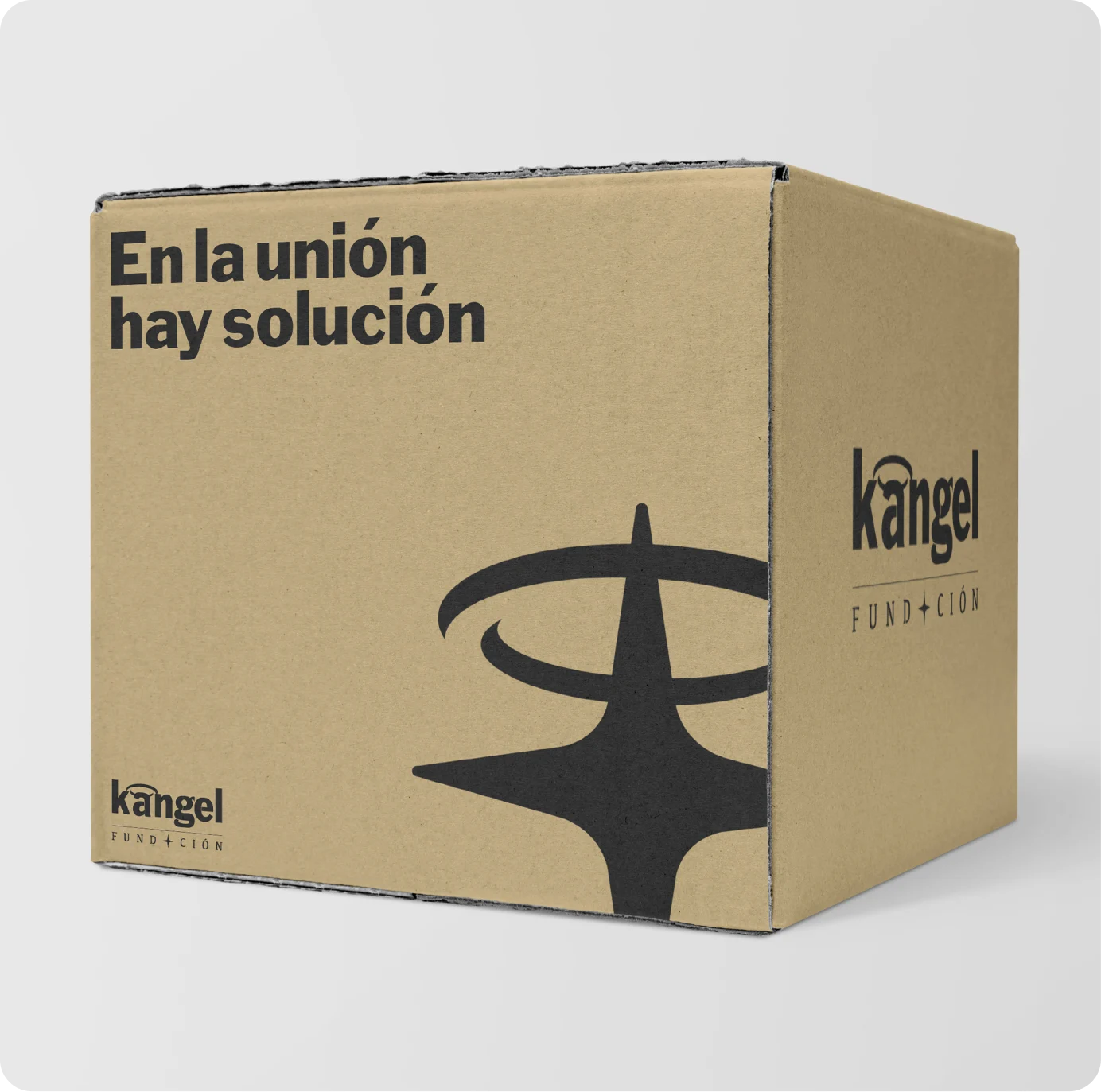
The star travels alone
Separated from the logotype, the star still carries the meaning and is easy to remember.
- 04
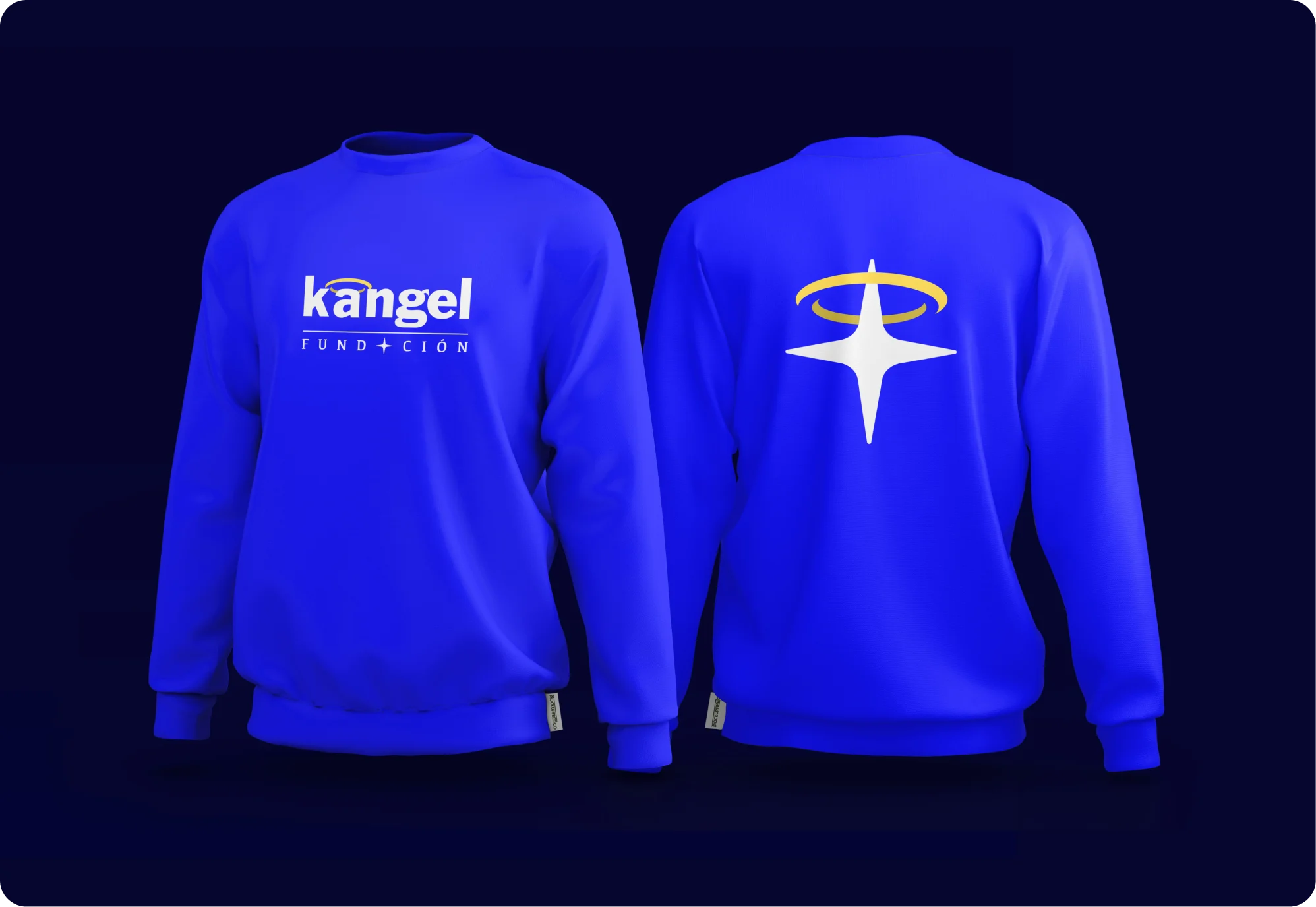
Wear for every alliance
Co-branded wear for events with regional foundations and the airline Rutaca.
More screens
Contact